Car Performance Schlephack & Lemke
New corporate design, stationery, signage, website and tracking for a certified car repair workshop.
- Client
- Car Performance Schlephack & Lemke
Solingen - Services
- Web & digital · Visibility
- Website
- carperformance-sl.de ↗
- Certified car repair workshop in Solingen
- Working on cars for more than 25 years
- Servicing, MOT/TÜV inspection, tyres, auto glass and accident repair
Car Performance Schlephack & Lemke is a certified car repair workshop in Solingen – working on cars for more than 25 years, from servicing, TÜV inspections and tyres to accident repair. What was missing was a public image that looks as professional as the work done in the workshop.
I developed a new visual identity for the business and applied it everywhere: design guidelines, stationery, signage and the new website.
Scope of work.
- Corporate design: logo, colours, typography
- Design guidelines
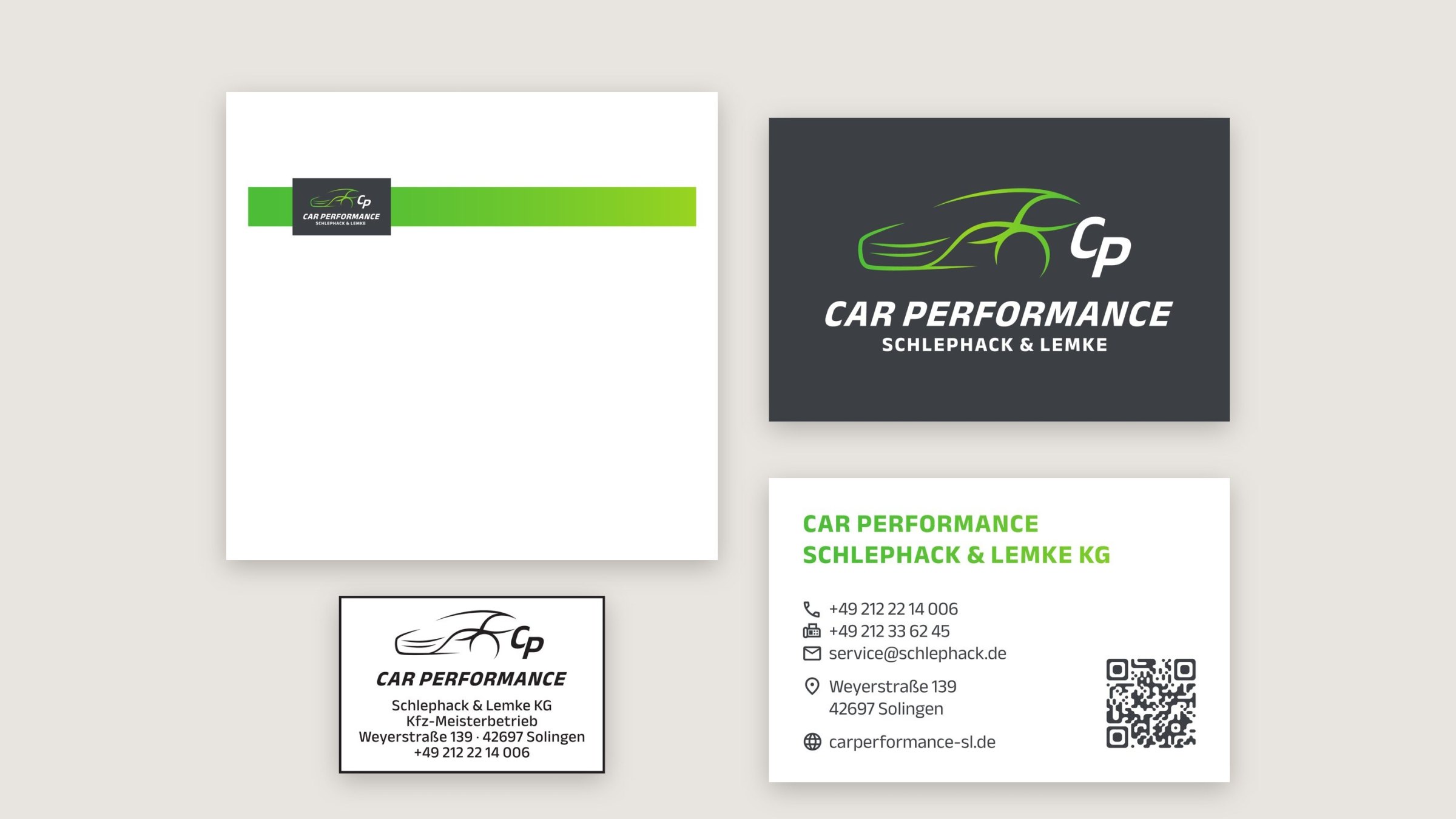
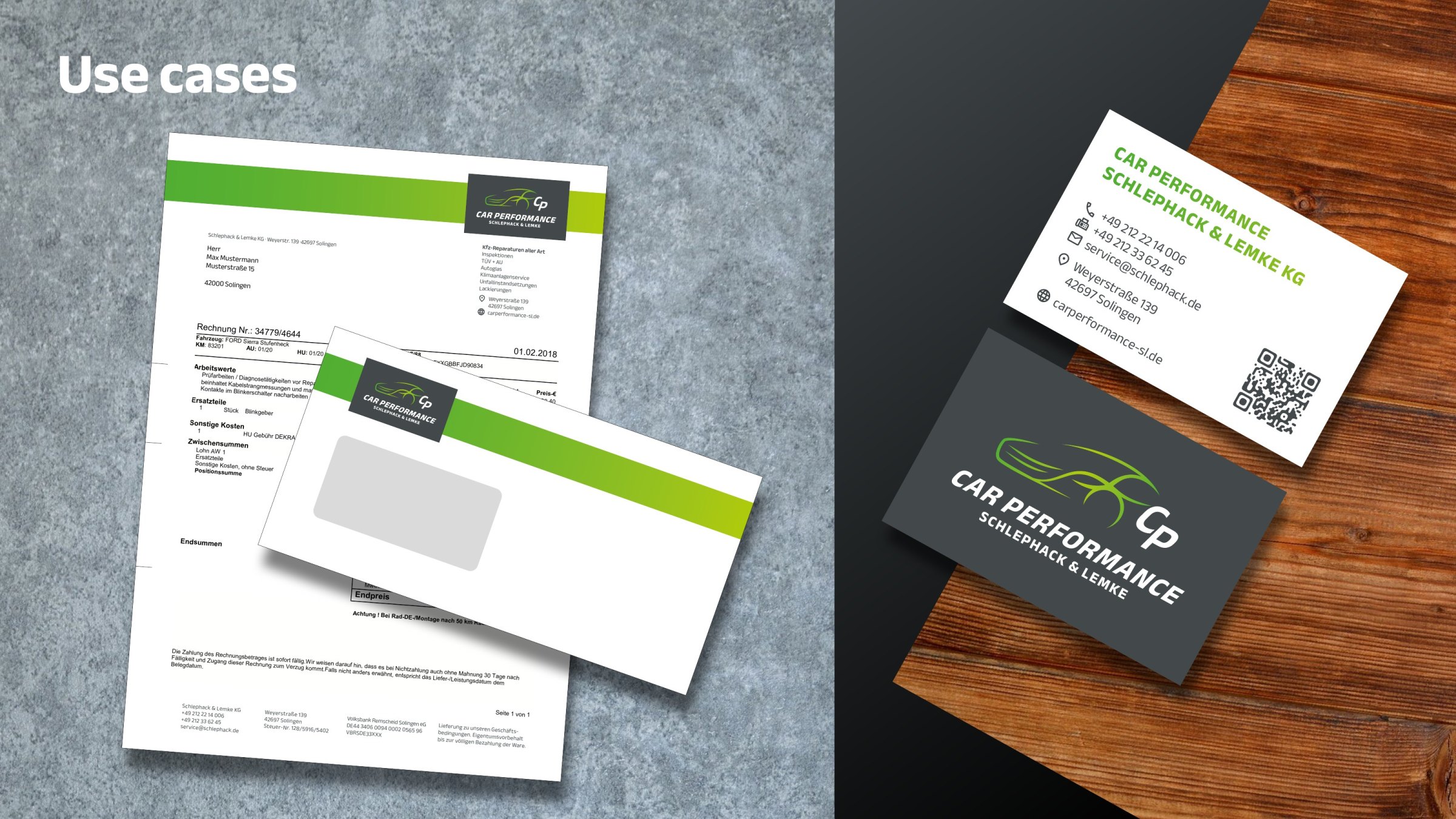
- Stationery: business card, envelope, stamp
- Signage: façade, pylon, entrance
- Digital compositions: logo on the building and on the vehicle
- Website: design & build
- Tracking: consent-based website analytics (GDPR)
The logo
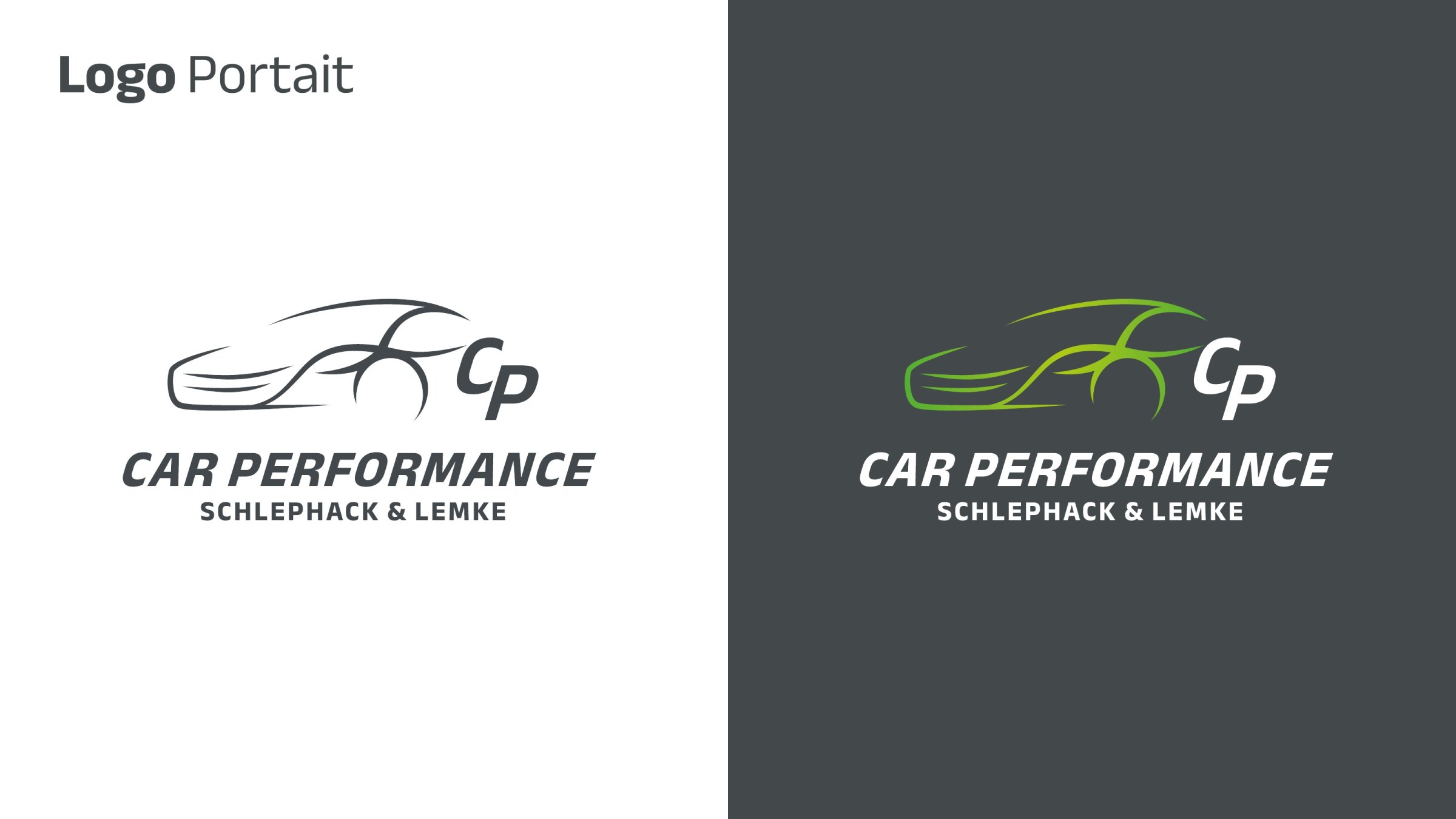
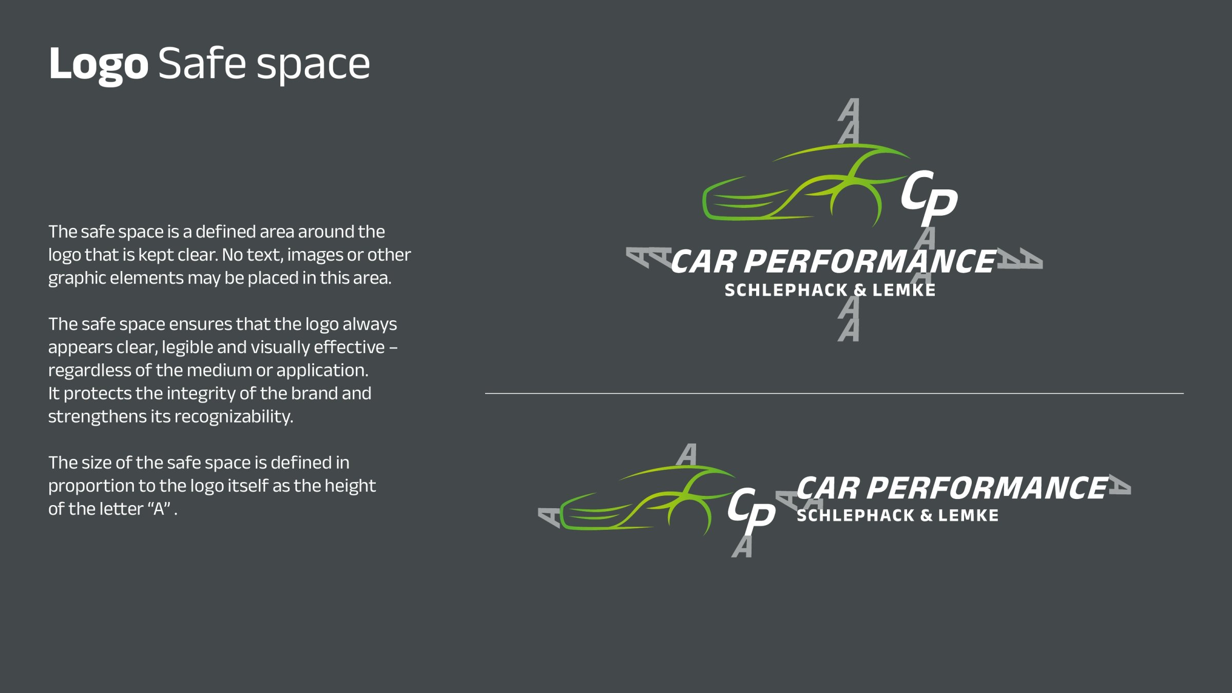
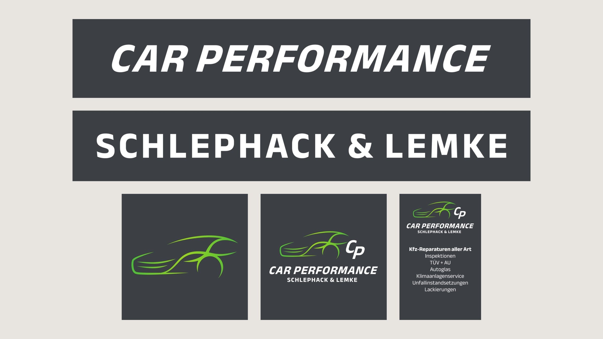
The silhouette of a sports car combined with the initials CP: the logo works in portrait and landscape format, on light and dark backgrounds. A defined clear space keeps it legible wherever it appears.

Colours
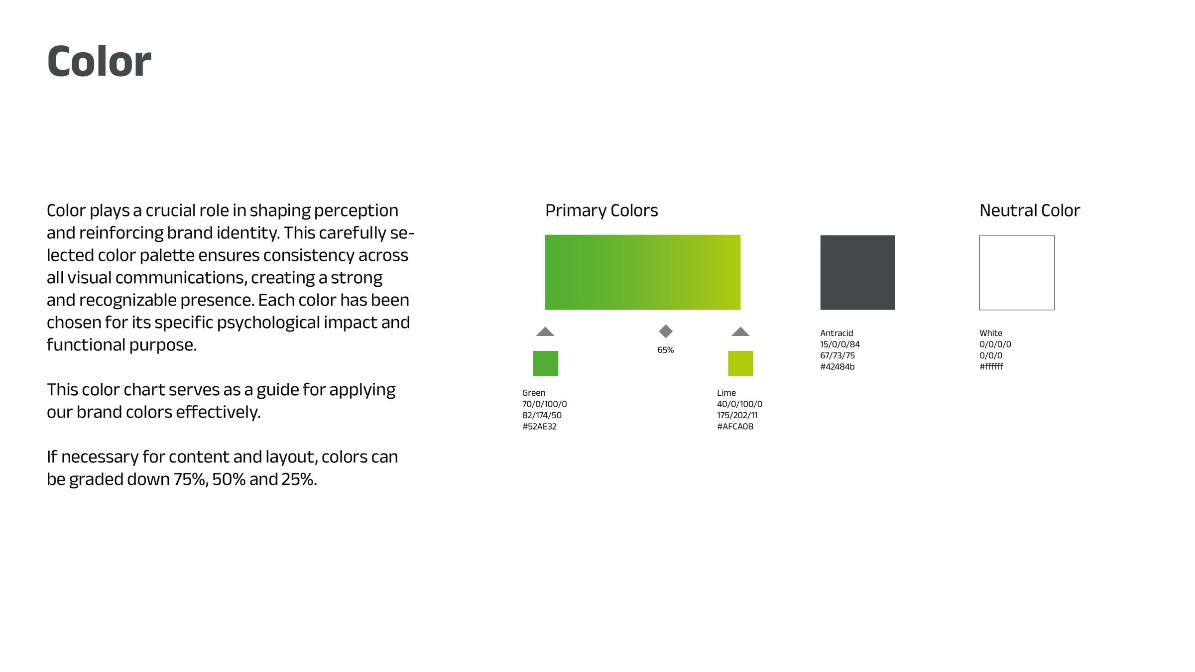
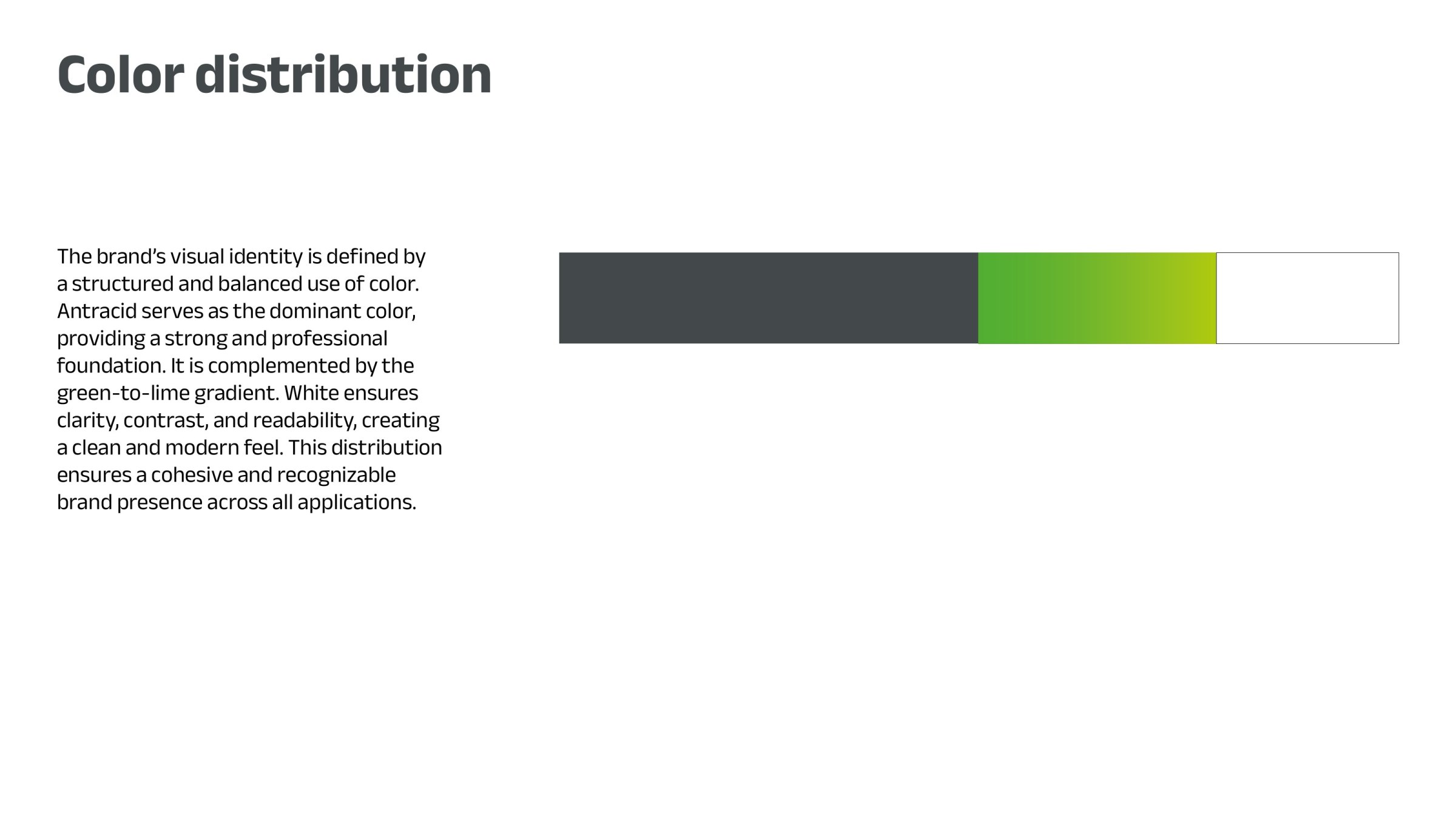
Anthracite as a calm, strong base, paired with a gradient from green to lime that conveys speed and technology. White adds clarity. This keeps the brand recognisable wherever it shows up.
Typography and imagery
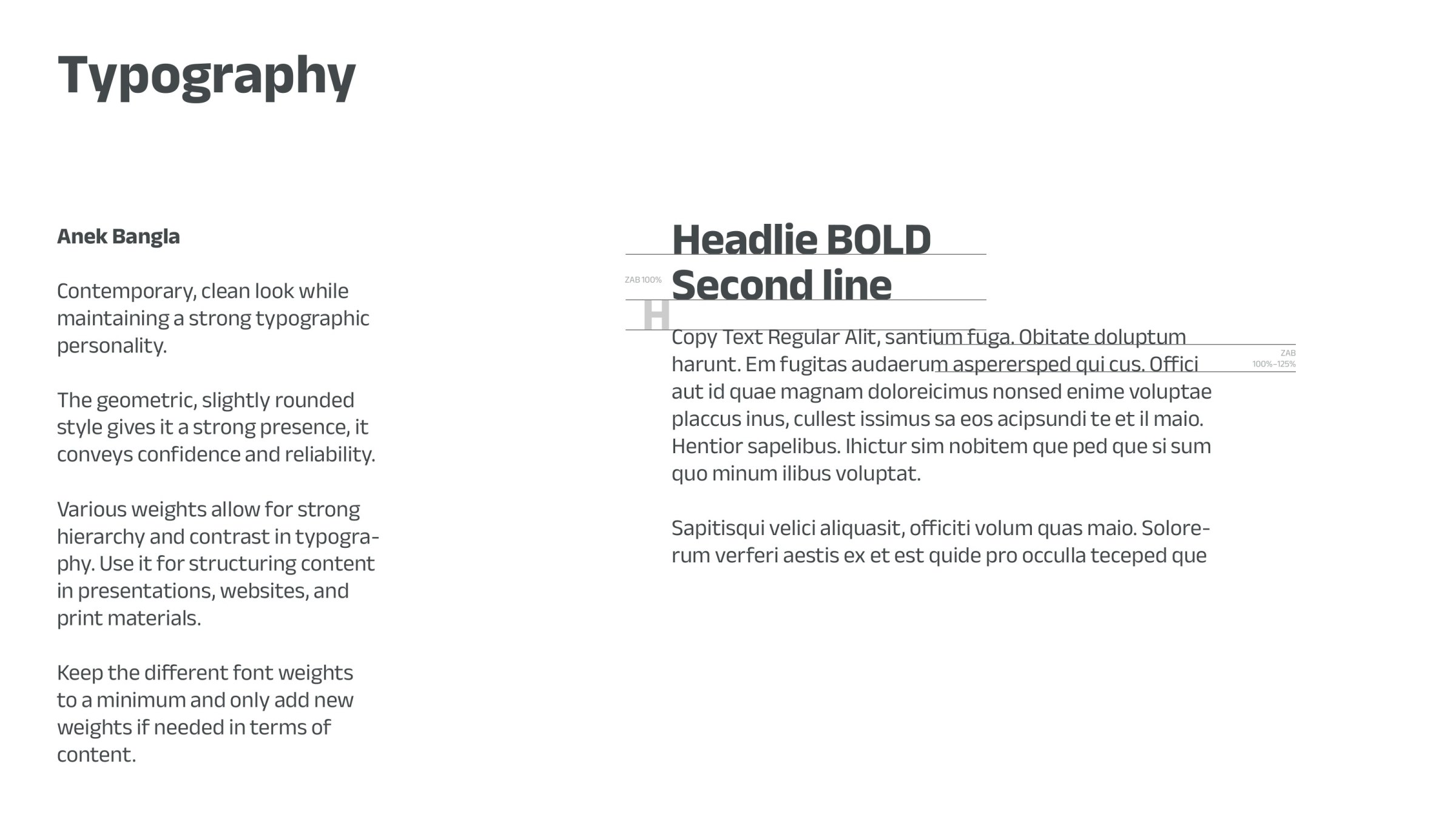
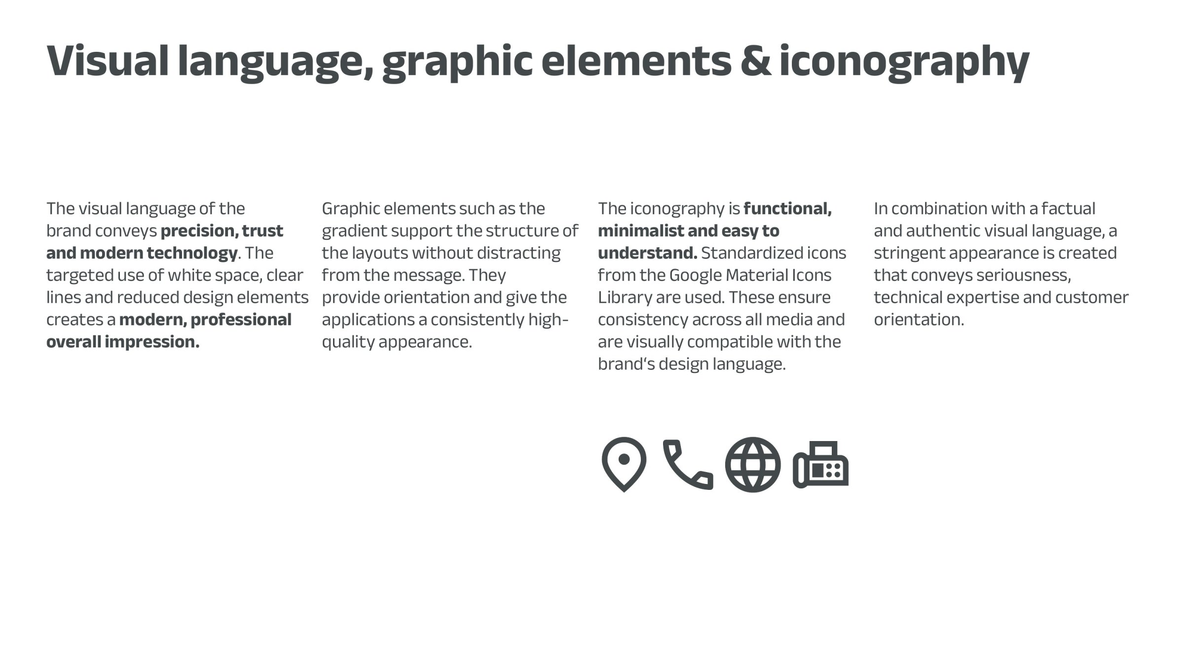
A clean, modern typeface with just a few weights, reduced icons and plenty of white space: precise, trustworthy and technical – just like the workshop itself. Everything is documented in the design guidelines so that every future design fits in.
Stationery
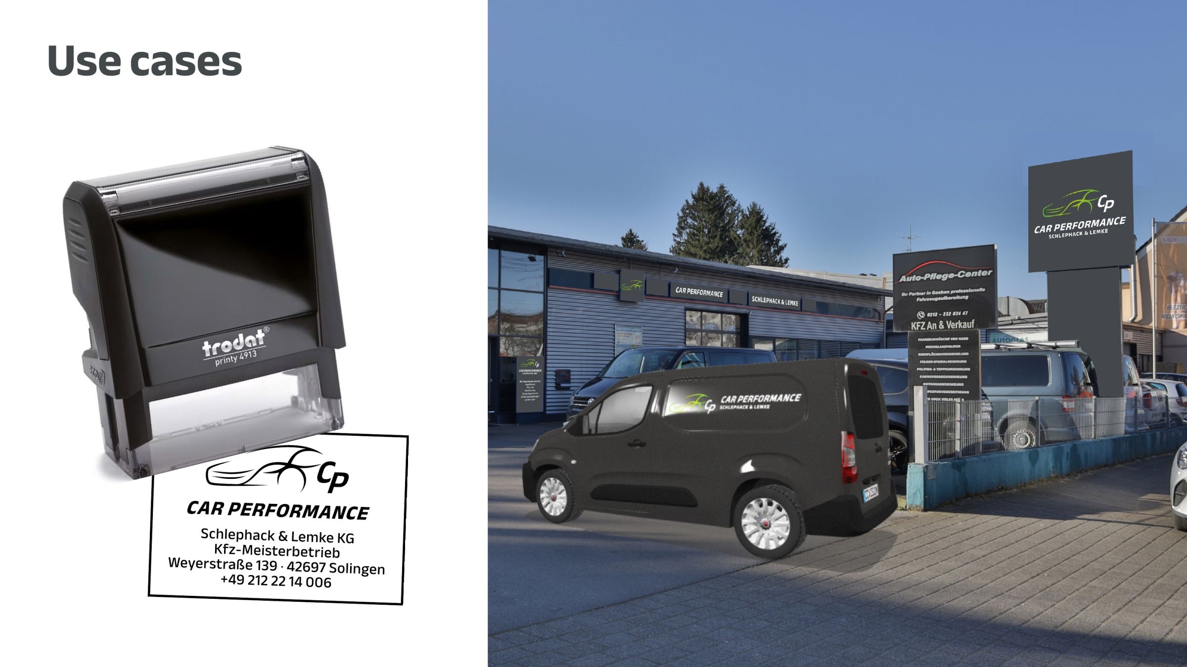
Business card, envelope, letterhead and stamp: the same clear image from the first handshake to the invoice.
Signage
Façade, pylon and entrance: the signs carry the visual identity outside – so the workshop can be recognised from the street.
To help the client picture the result in advance, I created digital compositions: the new logo placed directly onto photos of the building and the company vehicle. This made it possible to decide before printing how the signs and lettering would look on site.
The new website
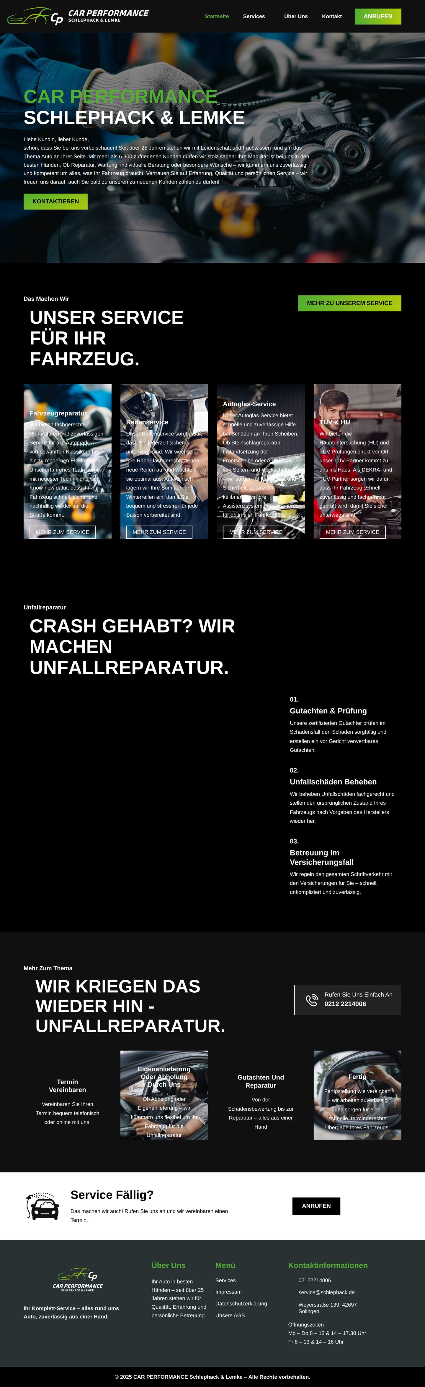
Clearly structured and easy to take in: all services at a glance, a dedicated section for accident repair that explains the process in a few steps, and a direct line to the workshop – on a smartphone just as well as on a computer.

Tracking: what the website delivers
So that the website doesn't just look good but delivers measurable results, I set up tracking for the business. The workshop can now see how many people visit the site, which services they are interested in and where enquiries come from. Measurement is privacy-compliant – it only starts once visitors have given their consent in the cookie banner.